Previous Project |
Next Project |
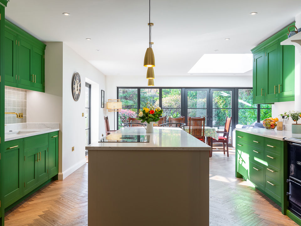
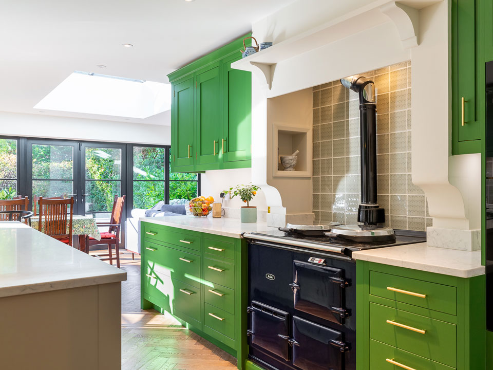
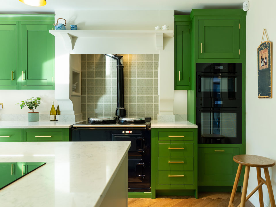
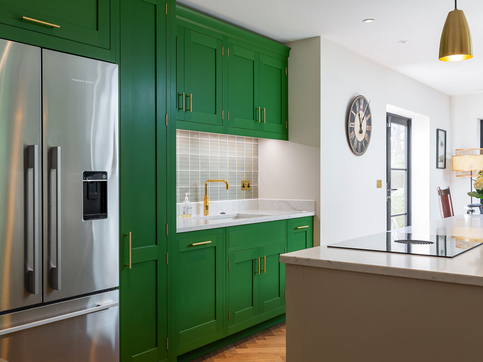
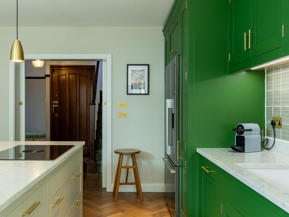
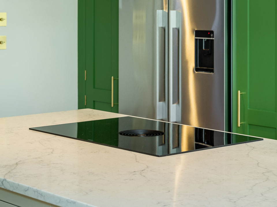
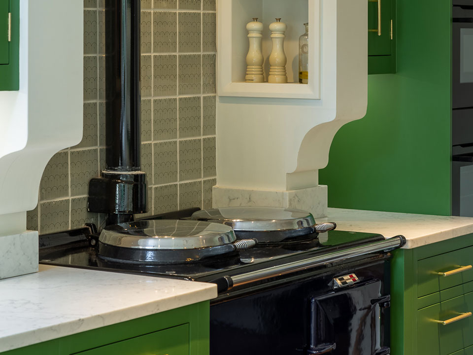
Our AG Quartz Fusion White not only gives a stunning contrast against the bold green in this project but also compliments the muted sage green of the island.
This space is cleverly designed with three of the main features, the fridge, the hob and the sink positioned in a perfect triangle for ease of use.
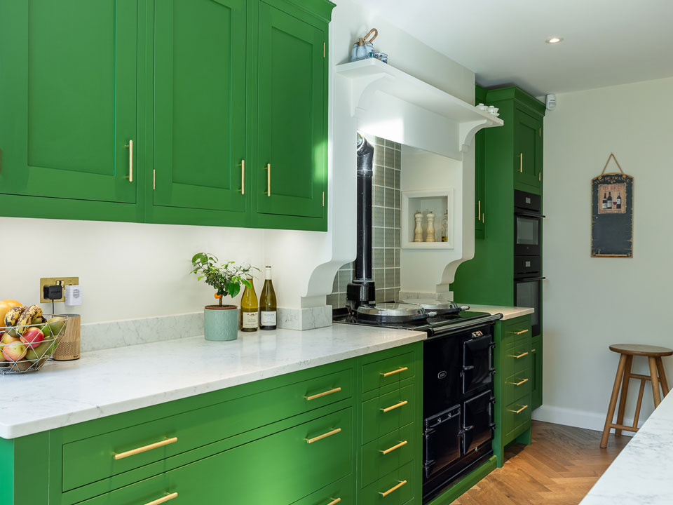
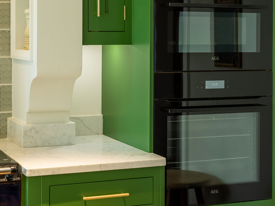
With a symmetrical feel to the layout, opposite the sink run is the aga, with worktops spreading out either side. The decision not to use a quartz splashback behind the hob helps keep the aga run and sink run looking uniform.
Project Details
Cabinetry by: Cloisters Design.
AG Quartz Fusion White
A stunning symetrical project with central island and outer worktop runs.
